

There are no hard and fast rules about how you must combine colours in commercial photography, but learning colour theory is helpful for beginners. Vivid imagery is often achieved by smart use of contrasting shades, also known as complementary colours.
We take a look at the use of complementary and analogous colours in food photography.
What are Complementary Colours?
Most photographers are familiar with the colour wheel, an ideal starting point for those considering colour theory. Below is an example of the colour wheel found in DecoArt Blog.
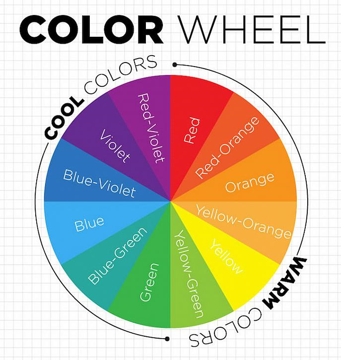
As you can see, the 12 colours used are broken down into warm and cool shades. A basic principle of colour theory is use of complementary colours for vivid photographs. Colours that sit opposite each other on the above diagram are often paired to great effect.
The contrast of warm and cool colours can appear dynamic and striking in food photography, but it’s not as simple as throwing opposite shades together. Beginner photographers need to think about composition, textures and background shades when trying to take advantage of complementary colours.
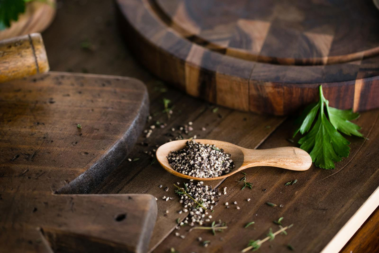
Create Warmth Through Analogous Colours
Not all food photography is intended to be bold and striking. Warm images of comfort food can be achieved by using analogous colours, which are colours that sit adjacent to each other on the colour wheel.
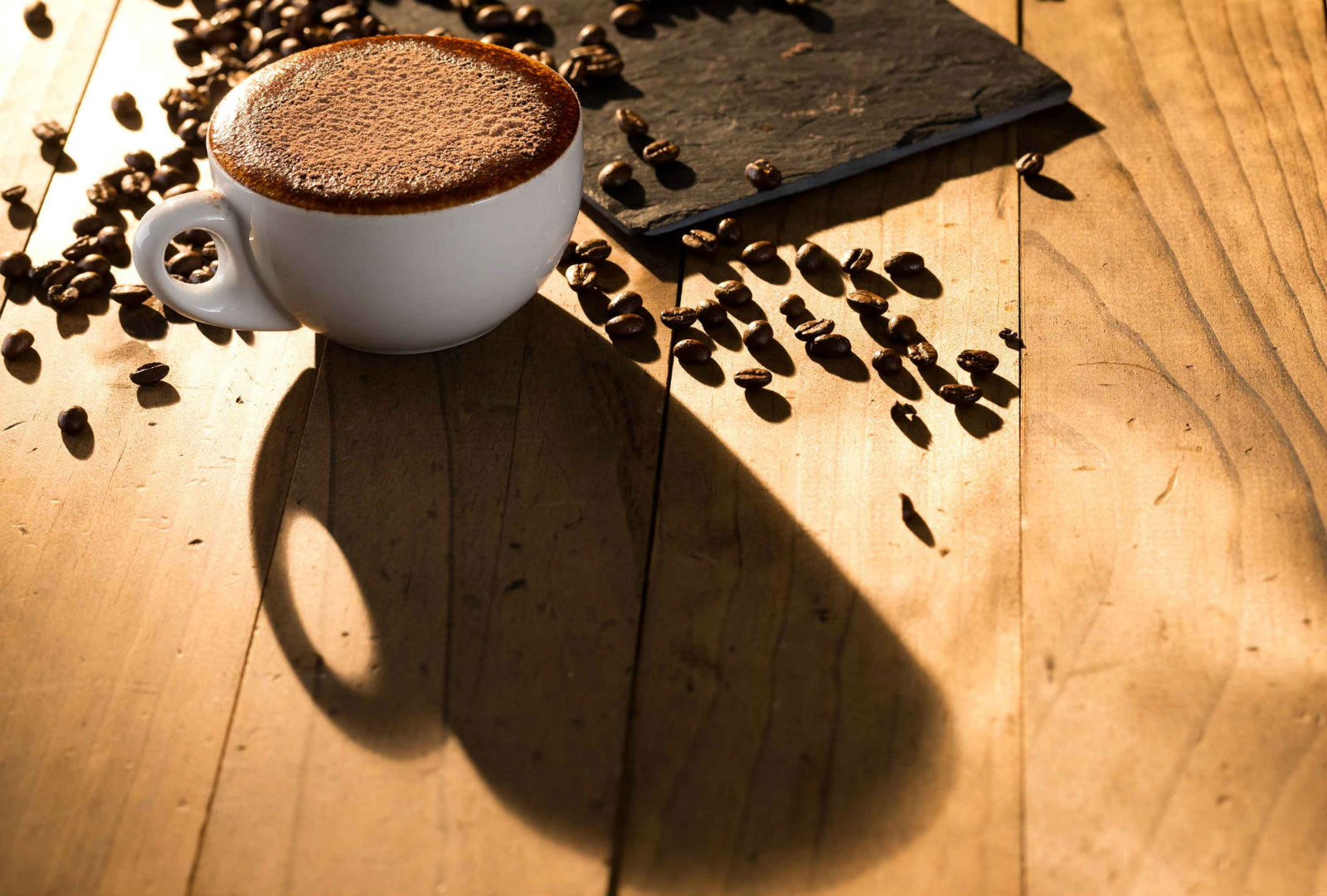
In this image, a wooden background is chosen to blend with the subjects while still utilising natural light. You can use analogous colours while ensuring the subject of your image is still the dominant aspect – in this example, the long shadow draws your eye to the cup and gives it power.
Keep the Subject in Focus with a Light Background
A standard tactic in food photography is whitewashing the background of your image. Using white, pastel or other colours that flood the subject with light can look very appealing.
This doesn’t necessarily mean the background of your image has to be bare. You can use tablecloths, linens and other innovative methods to create lines that draw focus.
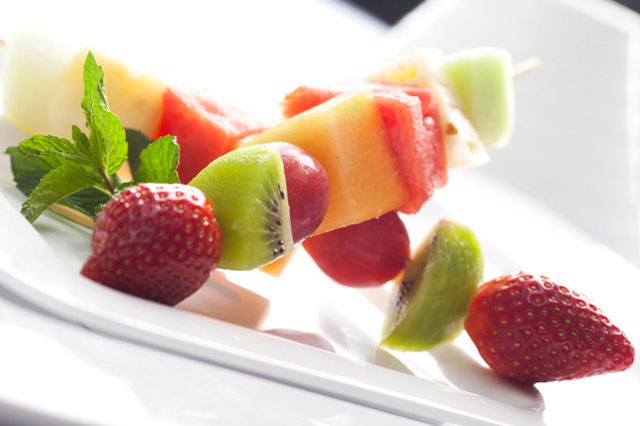
Create a Striking Impression with a Bold Colour Palette
Sweet and delicious foods are best served by way of a bold colour palette that makes a big impression. These images of desserts and drinks showcase different colours in such a way that you can almost taste the flavours.
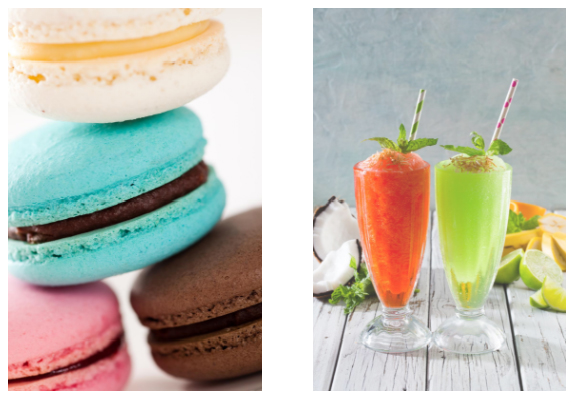
By using a simple, light-filled background, the images are dominated by the very food which is meant to dominate our taste buds. Both images make use of the complementary colours principle – orange and blue are paired together in the macaroon image, while red-orange is placed next to lime green inside the glasses.
Outstanding Food Photography from Porfyri Photography
Food photography is about more than just complementary colours. Creating high-quality food imagery requires creativity, patience and a deep understanding of what the general public finds appealing.
Andrew Porfyri has worked as a commercial photographer for numerous food brands, including Eagle Boys, The Coffee Club and Nandos.
To secure Porfyri for food photography services, give us a call on (07) 3393 0066 or email us at porfyri@porfyri.com.au.